PRINT: Australian Ballet Brochure
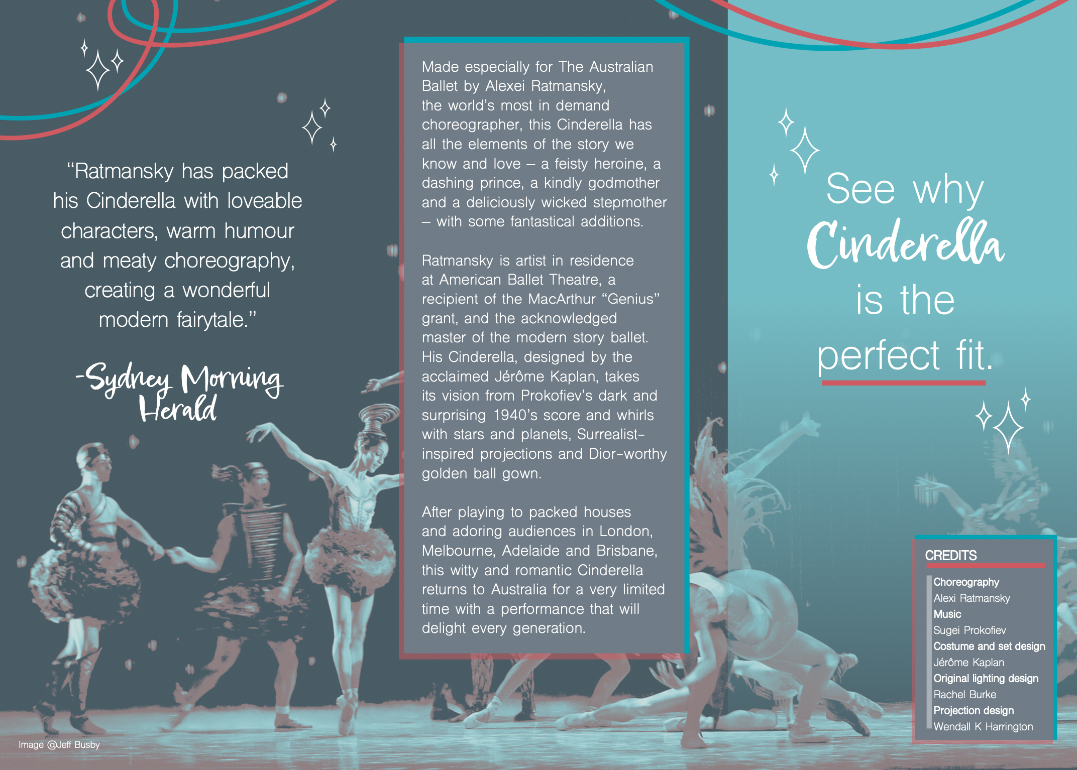
The task was deceptively simple - design a brochure for The Australian Ballet’s interpretation of Cinderella. The catch? The client had requested only duo-tone to save on printing costs. As you can see by my final design, I chose a brilliant turquoise to contrast against a bright salmon tone. When these two colours overlap, they create a curious shade of sepia. Using only the images and copy provided, I designed this very unique pamphlet.
Looking to other designers for inspiration, I initially created a mood-board of duo-tone designs to start off the design journey. Then, I took to the Australian Ballet’s website itself, and found some interesting photos from the Cinderella ballet. The Australian Ballet’s interpretation of Cinderella appeared to be quite quirky and playful, and I very much wanted this to shine through in my brochure design. The teal and salmon shades I mentioned earlier? They were drawn straight from the colours of the two step-sisters featured in the picture on the right. Overall, this was a very rewarding project, and I learned much in terms of setting up a document and brochure ready for printing.


